
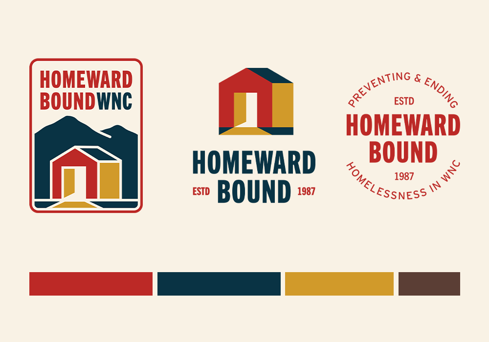
Introducing Homeward Bound of WNC’s new look!

Happy client moving into his new home
Landlord partnership participant
Since 2020, we have expanded significantly to meet the needs of our Asheville community, offering various programs focused on moving folks straight from homelessness into housing, including Rapid Re-Housing, Supportive Services for Veteran Families, and Compass Point Village.
In the midst of this growth, we’ve welcomed a new permanent CEO, Dr. Simon Dwight, who brings a vision and strategy to our organization that has allowed us to retain our strength and stability, while welcoming innovation and challenging systems that have limited our services and impact in the past.

What will remain the same at

Homeward Bound?

Key Chain with Homeward Bound Logo
Our mission and values will remain firm.
We are here to prevent and end homelessness in our community through permanent housing and support.
We believe everyone deserves a HOME.
We believe in the absolute value and worth of every single human.
We believe that all services should be offered with respect and empathy, in the spirit of hope and recovery.
We believe that homelessness is a solvable problem.

Why we’re refreshing the brand

“Our journey has shown us just how resilient we are. In our almost 40-year history, we have grown from a small grassroots organization to an established nonprofit leader in ending homelessness. We want our branding (look and feel) to reflect that expertise and professionalism, while also ushering us into contemporary times and reflecting our current voice. We are poised to be here for our community – strong, stable, and engaged- for the next 40 years and more.”

– Jessie Figueroa
Homeward Bound Resource Development Director


“We know that the work we do is incredibly complex and we hope these changes will bring clearer, more accessible communications that explain our client’s journey from beginning to end.”

– Melissa Duong
Homeward Bound Board President

Homeward Bound Logos old and new

About our new logo

Our new logo is a home with a door that opens inward, signifying a residence rather than a public or commercial building. The open door and pathway are gold to symbolize the light, warmth, and safety of a home, while the blue mountains represent our organization’s roots in Western North Carolina. Our warm primary colors are the building blocks of the new branding, and red structures symbolize refuge and hospitality. 

We’ve introduced versions of the logo that include our roots and regionality—highlighting our pride in being members of the Western North Carolina mountain community. However, it also symbolizes that a home is just the start, and there are still mountains to climb—both for the client towards lasting stability and for our organization in terms of strategic work to end homelessness in WNC.

We plan to pay homage to our history and partners (staff, volunteers, donors) by keeping our key logo to represent our Key Society, who remain the steady pillars supporting our structure and work to end homelessness here in WNC. Thank you for all you’ve done and continue to do.

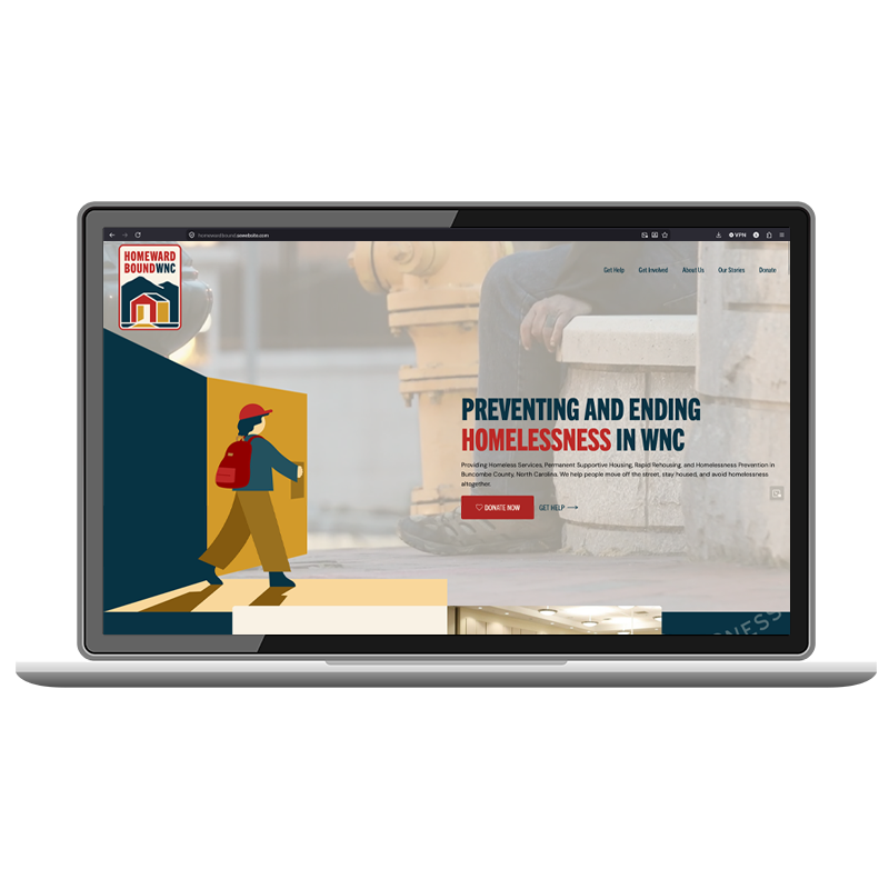
About our new website

Along with our new branding, we’ve updated our website to better serve our community. You’ll now find more detailed information about our homelessness and housing programs, a timeline that reflects our deep roots in Western North Carolina, and easy-to-access “Get Help” pages designed to connect neighbors quickly with the support they need. 

Thank you for being a part of this new chapter for our organization. 

– Homeward Bound of WNC